Accordion
An Accordion lets users hide and reveal sections of related content. It helps reduce visual clutter by showing only section titles by default, while allowing users to expand the content they need.
Code example
import { Accordion, AccordionItem } from '@yleisradio/yds-components-react';

<Accordion>
  <AccordionItem title="First Item">
    Content for first item
  </AccordionItem>
  <AccordionItem title="Second Item">
    Content for second item
  </AccordionItem>
</Accordion>
Why to use
Accordion helps users navigate large amounts of content by grouping related information into collapsible sections. It reduces visual clutter and cognitive load by showing only section titles by default, while still allowing users to access detailed content when needed. Accordions are especially useful when most users need only part of the available information, such as in help content, rules, or frequently asked questions.
When to use
Use an Accordion when content can be divided into independent, optional sections and it is not essential for all content to be visible at once. Accordions work well when users benefit from scanning headings first and choosing what to expand.
- Use an Accordion for supplementary or secondary content.
- Use when sections can be read independently, in any order.
- Use for FAQs, instructions, rules, help content, and settings.
- Use when reducing vertical scrolling improves clarity and scannability.
- Don’t hide critical or mandatory information inside an Accordion.
- Don’t use Accordion for navigation between views — use NavigationTabs or SectionTabs instead.
- Don’t use Accordion when content requires focused attention or user action — use a Dialog (Modal or BottomSheet) instead.
- Don’t use Accordion when there is only one short expandable section — use read more buttton/show more button instead.
- Don’t nest Accordions inside other Accordions.
Content Guidelines
Accordion titles are the primary decision point for users. Users decide whether to expand a section based on the title alone, so titles must clearly describe what the content contains.
- Use short, descriptive titles that summarize the content (e.g. “Säännöt ja pistejako”, “Palkinnot”, “Mikä Tietäjä on?”).
- Phrase titles in a way that matches the content type — questions work well for FAQs.
- Keep wording parallel across items to support scanning.
- Place the most commonly needed or most important item first.
- Don’t use vague titles like “Lisätietoja” or “Muut”.
- Don’t use long sentences or explanatory text as titles.
- Don’t repeat the same wording across multiple items.
- Don’t rely on the expanded content to explain what the section is about.
Anatomy
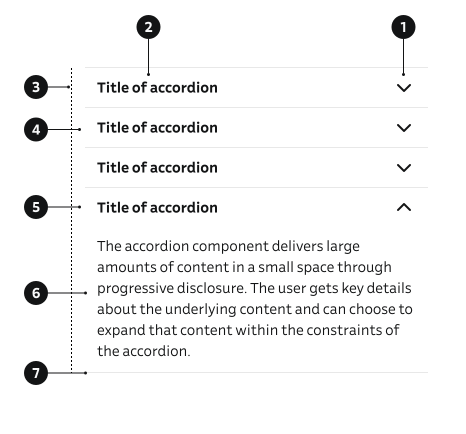
- Icon – Visual indicator that shows whether the section is expanded or collapsed.
- Title – The clickable header that summarizes the content of the section.
- Group container – Wraps the title and content and manages spacing, alignment, borders, and wrapping.
- Closed item – The closed state of the accordion item.
- Open item – The open state of the accordion item.
- Content – The section that contains the detailed content, revealed when the item is expanded.
- Border – Optional visual separator between sections.
Key Accordion Props
Use these props to configure the Accordion component.
children
The AccordionItem components to display.
| Type | Example | Description |
|---|---|---|
React.ReactNode | Content 1 Content 2 | Child AccordionItem components |
Code example
<Accordion>
  <AccordionItem title="Item 1">Content 1</AccordionItem>
  <AccordionItem title="Item 2">Content 2</AccordionItem>
</Accordion>
Key AccordionItem Props
Use these props to configure the AccordionItem component.
title
The title text or content displayed in the accordion header.
| Type | Example | Description |
|---|---|---|
React.ReactNode | Content | Title content for the accordion item |
Code example
<AccordionItem title="Section Title">Content</AccordionItem>
<AccordionItem title={<strong>Bold Title</strong>}>Content</AccordionItem>
variant
Visual style variant of the accordion item.
| Value | Example | Description |
|---|---|---|
default | Content | Default style with border |
noBorder | Content | Style without border or padding |
Code example
<AccordionItem variant="default" title="With Border">
  Content
</AccordionItem>
<AccordionItem variant="noBorder" title="Without Border">
  Content
</AccordionItem>
size
Size of the accordion item.
| Value | Example | Description |
|---|---|---|
sm | Content | Small size |
md | Content | Default medium size |
lg | Content | Large size |
Code example
<AccordionItem size="sm" title="Small">
  Content
</AccordionItem>
<AccordionItem size="md" title="Medium">
  Content
</AccordionItem>
<AccordionItem size="lg" title="Large">
  Content
</AccordionItem>
defaultOpen
Whether the accordion item should be open by default.
| Type | Example | Description |
|---|---|---|
boolean | Content | Opens the item on initial render |
Code example
<AccordionItem defaultOpen title="Open by Default">
  Content
</AccordionItem>
<AccordionItem defaultOpen={false} title="Closed by Default">
  Content
</AccordionItem>
isDisabled
Whether the accordion item is disabled.
| Type | Example | Description |
|---|---|---|
boolean | Content | Disables interaction with the accordion item |
Code example
<AccordionItem isDisabled title="Disabled Item">
  Content
</AccordionItem>
removePadding
Removes padding from the accordion content.
| Type | Example | Description |
|---|---|---|
boolean | Content | Removes padding from content area |
Code example
<AccordionItem removePadding title="No Padding">
  Content
</AccordionItem>
contentProps
Additional props for the content container.
| Type | Example | Description |
|---|---|---|
{ padding?: 'default' | 'horizontal' | 'vertical' | 'none' } | Content Content Content 3 Content 4 | Custom padding configuration for content |
Code example
<AccordionItem contentProps={{ padding: 'default' }} title="Item">
  Content
</AccordionItem>
<AccordionItem contentProps={{ padding: 'horizontal' }} title="Item">
  Content
</AccordionItem>
<AccordionItem contentProps={{ padding: 'vertical' }} title="Item">
  Content
</AccordionItem>
<AccordionItem contentProps={{ padding: 'none' }} title="Item">
  Content
</AccordionItem>
Behavior
- Each accordion item expands and collapses independently.
- Multiple items can be open at the same time.
- Clicking the title toggles the expanded state.
- The icon (chevron) rotates or switches to reflect expanded vs collapsed state.
Accessibility
- Provide a unique id on each AccordionItem for proper labeling and control linkage.
- Accordion headers must be focusable and keyboard-activatable so users can expand and collapse items with the keyboard (for example, using Enter or Space).
(WCAG 2.1.1 — Keyboard) - Ensure both the header and the panel have an accessible name by using clear, descriptive titles and avoiding empty panels.
(WCAG 2.4.6 — Headings and Labels)
Implementation examples
FAQ
Use an Accordion for frequently asked questions so users can expand only the answers they need.
Tilauksen voit peruuttaa Asetukset-sivulta tai ottamalla yhteyttä asiakaspalveluun.
Code example
<Accordion>
  <AccordionItem title="Miten voin peruuttaa tilauksen?">
    Tilauksen voit peruuttaa Asetukset-sivulta tai ottamalla yhteyttä asiakaspalveluun.
  </AccordionItem>
  <AccordionItem title="Milloin tilaus toimitetaan?">
    Toimitus tapahtuu 1–3 arkipäivän kuluessa tilauksesta.
  </AccordionItem>
  <AccordionItem title="Voinko vaihtaa maksutapaani?">
    Kyllä, maksutavan voit vaihtaa tilin asetuksista milloin tahansa.
  </AccordionItem>
</Accordion>
One item open by default
Use defaultOpen to show one section expanded on first load so users see sample content without clicking.
Code example
<Accordion>
  <AccordionItem title="First Item">Content for first item</AccordionItem>
  <AccordionItem title="Second Item" defaultOpen>
    Content for second item (open by default)
  </AccordionItem>
  <AccordionItem title="Third Item">Content for third item</AccordionItem>
</Accordion>
API Reference
Accordion Props
The Accordion component accepts all standard HTML <div> attributes in addition to the following props:
| Prop | Type | Required | Default | Description |
|---|---|---|---|---|
children | React.ReactNode | No | — | AccordionItem components to display |
AccordionItem Props
The AccordionItem component accepts all standard HTML <span> attributes in addition to the following props:
| Prop | Type | Required | Default | Description |
|---|---|---|---|---|
title | React.ReactNode | Yes | — | Title content for the accordion item |
id | string | No | — | Unique identifier for accessibility |
variant | 'default' | 'noBorder' | No | 'default' | Visual style variant |
size | 'sm' | 'md' | 'lg' | No | 'md' | Size of the accordion item |
defaultOpen | boolean | No | false | Whether the item is open by default |
isDisabled | boolean | No | false | Whether the item is disabled |
removePadding | boolean | No | — | Removes padding from content area |
contentProps | { padding?: 'default' | 'horizontal' | 'vertical' | 'none' } | No | {} | Additional props for content container |
children | React.ReactNode | No | — | Content displayed when expanded |
Type Definitions
export type AccordionSize = 'sm' | 'md' | 'lg';
export type Padding = 'default' | 'horizontal' | 'vertical' | 'none';

export interface AccordionContentDSProps {
  padding?: Padding;
}

export interface AccordionItemDSProps {
  id?: string;
  variant?: 'default' | 'noBorder';
  title: React.ReactNode;
  size?: AccordionSize;
  defaultOpen?: boolean;
  isDisabled?: boolean;
  contentProps?: AccordionContentDSProps;
  children?: React.ReactNode;
  removePadding?: boolean;
}

export interface AccordionDSProps {
  children?: React.ReactNode;
}

export type AccordionProps = HTMLAttributes<HTMLDivElement> & AccordionDSProps;
export type AccordionItemProps = HTMLAttributes<HTMLSpanElement> & AccordionItemDSProps;
Related Components
- Button – Can be used inside accordion content
- SectionTabs – Alternative component for organizing content
- NavigationTabs – Alternative component for navigation between views
- Dialog – Alternative component for showing content in a modal
- BottomSheet – Alternative component for showing content in a bottom sheet