ActionMenu
ActionMenu is a button that opens a dropdown list of actions. It groups multiple related actions into a compact control without changing the component’s state when an item is selected.
Code example
import { ActionMenu, MenuItem, MenuSeparator } from '@yleisradio/yds-components-react';

<ActionMenu text="Actions" id="action-menu-1" menuId="menu-1">
  <MenuItem onSelect={() => {}}>Option 1</MenuItem>
  <MenuItem onSelect={() => {}}>Option 2</MenuItem>
  <MenuSeparator />
  <MenuItem onSelect={() => {}}>Option 3</MenuItem>
</ActionMenu>
Why to use
ActionMenu provides a clear and space-efficient way to expose multiple related actions from a single entry point. Instead of showing several buttons side by side, ActionMenu keeps the interface uncluttered while still making all actions easily accessible.
It is built on top of Menu, ensuring consistent positioning, keyboard navigation, and accessibility across products while supporting typical action-based use cases such as sharing, editing, or managing content.
When to use
Use ActionMenu when the user needs to trigger one of several related actions that do not affect the component’s state.
- Use when multiple related actions are available from the same context.
- Use for secondary or contextual actions such as sharing, editing, or managing content.
- Use when space is limited and showing all actions at once would clutter the UI.
- Don’t use for selecting values or changing component state (use DropdownMenu instead).
- Don’t use for navigation between views or pages.
- Don’t use for a single action (use a Button instead).
Content Guidelines
ActionMenu items represent actions, not values.
- Use verbs for menu items (e.g. “Jaa”, “Muokkaa”, “Poista”).
- Keep labels concise and action-oriented.
- Group related actions using separators when necessary.
- Don’t use nouns or descriptive values as menu items.
- Don’t use vague labels like “OK” or “Kyllä”.
- Don’t mix actions with selection-type options in the same menu.
Anatomy
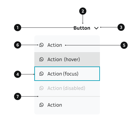
- ActionMenu button – The trigger that opens the list of actions.
- Label – Text describing the category of actions (e.g. “Actions”, “Share”).
- Chevron icon – Indicates that the button opens a dropdown.
- Menu surface – The floating container holding the action items.
- MenuItem (action) – A single actionable option inside the menu.
- MenuItem icon (optional) – An optional leading icon inside a
MenuItem - MenuSeparator (optional) – Groups related actions.
Key ActionMenu Props
Use these props to configure the ActionMenu component.
text
The text displayed on the action menu button.
| Type | Example | Description |
|---|---|---|
string | Button label text |
Code example
<ActionMenu text="Actions" id="menu-1" menuId="menu-1">
  <MenuItem onSelect={() => {}}>Option</MenuItem>
</ActionMenu>
children
Menu items to display in the dropdown menu.
| Type | Example | Description |
|---|---|---|
React.ReactNode | MenuItem components to display |
Code example
<ActionMenu text="Actions" id="menu-1" menuId="menu-1">
  <MenuItem onSelect={() => {}}>Option 1</MenuItem>
  <MenuItem onSelect={() => {}}>Option 2</MenuItem>
</ActionMenu>
dropdown
Whether to show a dropdown chevron icon.
| Value | Example | Description |
|---|---|---|
true | Shows the chevron icon | |
false | Hides the chevron icon |
Code example
<ActionMenu dropdown={true} text="Actions" id="menu-1" menuId="menu-1">
  <MenuItem onSelect={() => {}}>Option</MenuItem>
</ActionMenu>
<ActionMenu dropdown={false} text="Actions" id="menu-2" menuId="menu-2">
  <MenuItem onSelect={() => {}}>Option</MenuItem>
</ActionMenu>
openMenuOnClick
Whether clicking the button opens the menu.
| Type | Example | Description |
|---|---|---|
boolean | Controls if click opens the menu |
Code example
<ActionMenu openMenuOnClick={true} text="Actions" id="menu-1" menuId="menu-1">
  <MenuItem onSelect={() => {}}>Option</MenuItem>
</ActionMenu>
menuSize
Size of the menu items.
| Value | Example | Description |
|---|---|---|
sm | Small menu items | |
md | Default medium menu items |
Code example
<ActionMenu menuSize="sm" text="Actions" id="menu-1" menuId="menu-1">
  <MenuItem onSelect={() => {}}>Option</MenuItem>
</ActionMenu>
<ActionMenu menuSize="md" text="Actions" id="menu-2" menuId="menu-2">
  <MenuItem onSelect={() => {}}>Option</MenuItem>
</ActionMenu>
alignMenu
Horizontal alignment of the menu relative to the button.
| Value | Example | Description |
|---|---|---|
left | Aligns menu to the left | |
right | Aligns menu to the right (default) |
Code example
<ActionMenu alignMenu="left" text="Actions" id="menu-1" menuId="menu-1">
  <MenuItem onSelect={() => {}}>Option</MenuItem>
</ActionMenu>
<ActionMenu alignMenu="right" text="Actions" id="menu-2" menuId="menu-2">
  <MenuItem onSelect={() => {}}>Option</MenuItem>
</ActionMenu>
position
Preferred direction in which the menu opens relative to the trigger button. The menu automatically adjusts if it would be clipped by the viewport.
| Value | Example | Description |
|---|---|---|
bottom | Opens below the button (default) | |
top | Opens above the button | |
left | Opens to the left of the button | |
right | Opens to the right of the button |
Code example
<ActionMenu position="bottom" text="Actions" id="menu-1" menuId="menu-1">
  <MenuItem onSelect={() => {}}>Option</MenuItem>
</ActionMenu>
<ActionMenu position="top" text="Actions" id="menu-2" menuId="menu-2">
  <MenuItem onSelect={() => {}}>Option</MenuItem>
</ActionMenu>
<ActionMenu position="left" text="Actions" id="menu-3" menuId="menu-3">
  <MenuItem onSelect={() => {}}>Option</MenuItem>
</ActionMenu>
<ActionMenu position="right" text="Actions" id="menu-4" menuId="menu-4">
  <MenuItem onSelect={() => {}}>Option</MenuItem>
</ActionMenu>
Behavior
- Selecting an item triggers the associated action immediately.
- The ActionMenu label does not change based on selection.
- The menu opens from the trigger and closes after selection, outside click, or cancellation.
- The
positionprop controls the preferred direction in which the menu opens:'bottom'(default),'top','left', or'right'. The menu automatically adjusts if it would be clipped by the viewport. - Keyboard interaction:
- Arrow keys navigate between actions.
- Enter activates the focused action.
- Escape closes the menu.
Accessibility
- Ensure full keyboard support for all interactions.
(WCAG 2.1.1 — Keyboard) - Menu items have clear visual focus indicators.
(WCAG 2.4.7 — Focus Visible) - Each menu item exposes a clear, descriptive action name to assistive technologies.
(WCAG 4.1.2 — Name, Role, Value) - The menu state (open/closed) is communicated programmatically.
- Actions are perceivable and understandable without relying on icons alone.
Implementation Examples
Share menu
Social sharing links. There's a package for Share Button available for easier sharing functionality.
Code example
import { ActionMenu, MenuItem } from '@yleisradio/yds-components-react';
import { Link2, Mail, Whatsapp, Facebook, TwitterX, Linkedin } from '@yleisradio/yds-icons-react';

<ActionMenu text="Jaa" id="share-menu" menuId="share-menu-list">
  <MenuItem icon={<Link2 />} onSelect={() => navigator.clipboard.writeText('https://example.com')}>Kopioi linkki</MenuItem>
  <MenuItem icon={<Mail />} onSelect={() => window.open('mailto:?subject=Title&body=https://example.com')}>Sähköposti</MenuItem>
  <MenuItem icon={<Whatsapp />} onSelect={() => window.open('https://wa.me/?text=https://example.com', '_blank')}>WhatsApp</MenuItem>
  <MenuItem icon={<Facebook />} onSelect={() => window.open('https://www.facebook.com/sharer/sharer.php?u=https://example.com', '_blank')}>Facebook</MenuItem>
  <MenuItem icon={<TwitterX />} onSelect={() => window.open('https://x.com/intent/post?url=https://example.com', '_blank')}>X-viestipalvelu</MenuItem>
  <MenuItem icon={<Linkedin />} onSelect={() => window.open('https://www.linkedin.com/sharing/share-offsite/?url=https://example.com', '_blank')}>LinkedIn</MenuItem>
</ActionMenu>
API Reference
Props
The ActionMenu component accepts all standard Button props (except as and onClick) in addition to the following props:
| Prop | Type | Required | Default | Description |
|---|---|---|---|---|
text | string | Yes | — | Button label text |
id | string | Yes | — | Unique identifier for the button |
menuId | string | Yes | — | Unique identifier for the menu |
children | React.ReactNode | Yes | — | MenuItem components to display |
dropdown | boolean | No | true | Whether to show dropdown chevron icon |
openMenuOnClick | boolean | No | true | Whether clicking opens the menu |
onClose | () => void | No | — | Callback fired when menu closes |
onOpen | () => void | No | — | Callback fired when menu opens |
menuSize | 'sm' | 'md' | No | 'md' | Size of menu items |
alignMenu | 'left' | 'right' | No | 'right' | Horizontal alignment of menu |
position | 'top' | 'right' | 'bottom' | 'left' | No | 'bottom' | Preferred direction the menu opens |
Type Definitions
export interface ActionMenuDSProps {
  text: string;
  id: string;
  menuId: string;
  children: ReactNode;
  dropdown?: boolean;
  openMenuOnClick?: boolean;
  onClose?: () => void;
  onOpen?: () => void;
  menuSize?: 'md' | 'sm';
  alignMenu?: 'left' | 'right';
  position?: 'top' | 'right' | 'bottom' | 'left';
}

export type ActionMenuProps = ActionMenuDSProps & Omit<ButtonProps<'button'>, 'as' | 'onClick'>;
Related Components
- DropdownMenu – Alternative component for selectable menu options
- Button – ActionMenu extends Button functionality
- Menu - Base component for ActionMenu