Radio
A Radio Group is a collection of individual Radios that allows users to select one option from a small, clearly defined set.
Code example
import { Radio, RadioGroup } from '@yleisradio/yds-components-react';

<RadioGroup
  id="contact-pref"
  name="contact"
  label="Preferred contact method"
  selectedValue="email"
  onChange={() => {}}
>
  <Radio value="email" label="Email" />
  <Radio value="sms" label="SMS" />
  <Radio value="phone" label="Phone" />
</RadioGroup>
Why to use
Radio Groups provide an accessible and consistent way to make a single, mutually exclusive choice. They keep all options visible for easy comparison and clarify the selection context with a shared label, optional description, and unified validation.
When to use
Use a RadioGroup when users must choose exactly one option from a small, mutually exclusive set and the options should stay visible for comparison. NumericScale when the choice represents a position on a low–high range (e.g., satisfaction, agreement, ratings).
Differences between RadioGroup types
| Type | Purpose | Placement | Use case |
|---|---|---|---|
| RadioGroup | One mutually exclusive choice from a short list. | Mostly vertical; horizontal only for short labels. | Form questions, settings, preference selections (e.g., “Sähköposti”, “SMS”, “Puhelu”). |
| NumericScale | Choosing a point on a defined numerical range. | Horizontal with clearly labelled endpoints. | Ratings, satisfaction scores, Likert-style scales (e.g., “En pitänyt” – “Pidin erittäin paljon”). |
- Use when one option must be selected from a small set.
- Use when all options should be visible to support quick comparison.
- Use RadioGroupNumericScale for Likert-style or rating questions.
- Don’t use for multiple selections — use Checkboxes.
- Don’t use for an instant on/off UI state — use Switch.
- Don’t use when the list is long or needs searching — use Select or ComboboxSingleSelect.
- Don’t use when “no selection” is allowed but a single toggle would communicate better — consider Checkbox (single option) or Switch depending on intent.
Content Guidelines
Radio labels should be short, comparable, and unambiguous so users can scan and understand differences between options quickly.
- Write a concise group label that reads like a question or heading.(e.g., “Mieluisin yhteydenottotapa”)
- Keep option labels short and parallel in structure.(e.g., “Sähköposti”, “SMS”, “Puhelu”)
- Use the group description for brief clarification when needed.
- For NumericScale, label both ends of the range clearly.(e.g., “En pitänyt” – “Pidin erittäin paljon”)
- Don’t use long sentences as option labels—move explanations to the description.
- Don’t create overlapping or unclear choices.
- Don’t repeat label wording in each option.
- Don’t mix different answer types in one group.
Anatomy
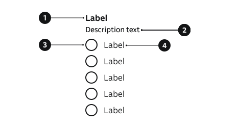
- Group label – Defines the purpose of the group.
- Description – Optional helper text below the label.
- Radio control – Circular selector; only one can be active.
- Option label – Text linked to each radio choice.
Key Radio Props
Use the following props to customize the Radio component to fit your needs.
variant
| Value | Example | Description |
|---|---|---|
primary | Default style for most use cases. | |
secondary | Uses highlight color for the control. |
Code example
<Radio variant="primary" value="email" label="Email" checked />
<Radio variant="secondary" value="email" label="Email" checked />
isDisabled
Non-interactive, dimmed styling.
| Type | Example | Description |
|---|---|---|
boolean | Temporarily prevents user interaction. |
Code example
<Radio value="email" label="Email" isDisabled checked />
hideLabel
| Type | Example | Description |
|---|---|---|
boolean | Visually hides label but keeps it accessible. |
Code example
<Radio value="email" label="Email" hideLabel />
controlAlign
| Value | Example | Description |
|---|---|---|
start | Positions the control before the label text. | |
end | Positions the control after the label text. |
Code example
<Radio value="email" label="Email" controlAlign="start" />
<Radio value="email" label="Email" controlAlign="end" />
Key RadioGroup Props
Use the following props to customize the RadioGroup component to fit your needs.
label
| Type | Example | Description |
|---|---|---|
string | Text label describing the purpose of the group. |
Code example
<RadioGroup
  id="contact"
  name="contact"
  label="Contact method"
  onChange={() => {}}
>
  <Radio label="Email" value="email" />
  <Radio label="Phone" value="phone" />
</RadioGroup>
description
Helper guidance placed below the group label.
| Type | Example | Description |
|---|---|---|
string | Provides additional context or instructions for the group. |
Code example
<RadioGroup
  id="contact"
  name="contact"
  label="Contact method"
  description="How should we reach you?"
  onChange={() => {}}
>
  <Radio label="Email" value="email" />
  <Radio label="Phone" value="phone" />
</RadioGroup>
errorMessage
| Type | Example | Description |
|---|---|---|
string | Shows an error message and applies error styles to the group. |
Code example
<RadioGroup
  id="contact"
  name="contact"
  label="Contact method"
  errorMessage="Please select a contact method"
  onChange={() => {}}
>
  <Radio label="Email" value="email" />
  <Radio label="Phone" value="phone" />
</RadioGroup>
direction
Layout orientation of the radio options.
| Value | Example | Description |
|---|---|---|
vertical | Stacks radios vertically (default). | |
horizontal | Arranges radios horizontally. |
Code example
<RadioGroup
  id="contact"
  name="contact"
  label="Contact method"
  direction="vertical"
  onChange={() => {}}
>
  <Radio label="Email" value="email" />
  <Radio label="Phone" value="phone" />
</RadioGroup>

<RadioGroup
  id="contact"
  name="contact"
  label="Contact method"
  direction="horizontal"
  onChange={() => {}}
>
  <Radio label="Email" value="email" />
  <Radio label="Phone" value="phone" />
</RadioGroup>
RadioGroupNumericScale (Likert / Rating)
Extends RadioGroup with optional semantic boundary labels.
| Prop | Type | Default | Description |
|---|---|---|---|
startLabel | string | — | Text describing the low end of the scale (e.g. "Not at all"). |
endLabel | string | — | Text describing the high end (e.g. "Very satisfied"). |
Code example
<RadioGroupNumericScale
  id="satisfaction"
  name="satisfaction"
  label="Satisfaction"
  startLabel="Low"
  endLabel="High"
  direction="horizontal"
  selectedValue="3"
  onChange={() => {}}
>
  <Radio value="1" label="1" />
  <Radio value="2" label="2" />
  <Radio value="3" label="3" />
  <Radio value="4" label="4" />
  <Radio value="5" label="5" />
</RadioGroupNumericScale>
Behavior
- Only one option can be selected at a time; choosing a new one deselects the previous.
- Radios in the same group share the same name attribute to ensure correct selection and navigation.
- The group label defines the question or context for all options.
- Use vertical layout for readability and horizontal for compact or scale-type choices.
- Disabled Radios remain visible but non-interactive.
- Supports both controlled (selectedValue, onChange) and uncontrolled (defaultChecked) usage.
- Error messages appear below the group and guide users to correct input.
Accessibility
- Each Radio must have a visible or programmatically associated label.
(WCAG 3.3.2 — Labels or Instructions) - Group related Radios under a shared group label describing the selection’s purpose.
(WCAG 1.3.1 — Info and Relationships) - Keyboard navigation: users move between Radios with arrow keys and select with Space or Enter.
(WCAG 2.1.1 — Keyboard) - Numeric Scale groups should include clear start and end labels to define the range meaning.
(WCAG 1.3.1 — Info and Relationships)
Implementation examples
With description
Code example
<RadioGroup
  id="newsletter"
  name="newsletter"
  label="Preferred learning method"
  description=" Choose the learning method that best supports your studying."
  selectedValue="weekly"
  onChange={() => {}}
>
  <Radio value="online" label="Online self-paced courses" />
  <Radio value="classroom" label="Instructor-led classroom training" />
  <Radio value="hybrid" label="Hybrid sessions" />
  <Radio value="group" label="Group discussions" />
  <Radio value="independent" label="Independent study" />
</RadioGroup>
With error message
Code example
<RadioGroup
  id="newsletter"
  name="newsletter"
  label="Preferred learning method"
  description=" Choose the learning method that best supports your studying."
  errorMessage="Please select a preference"
  onChange={() => {}}
>
  <Radio value="online" label="Online self-paced courses" />
  <Radio value="classroom" label="Instructor-led classroom training" />
  <Radio value="hybrid" label="Hybrid sessions" />
  <Radio value="group" label="Group discussions" />
  <Radio value="independent" label="Independent study" />
</RadioGroup>
Numeric scale rating
Code example
<RadioGroupNumericScale
  id="article"
  name="article"
  label="Did you like this article?"
  startLabel="Did not like"
  endLabel="Liked a lot"
  direction="horizontal"
  selectedValue="3"
  onChange={() => {}}
>
  <Radio value="1" label="1" />
  <Radio value="2" label="2" />
  <Radio value="3" label="3" />
  <Radio value="4" label="4" />
  <Radio value="5" label="5" />
</RadioGroupNumericScale>
See more examples in Storybook
API Reference
Props
Radio
The Radio component accepts all standard HTML <input> attributes in addition to the following props:
| Prop | Type | Required | Default | Description |
|---|---|---|---|---|
variant | VariantType | No | 'primary' | |
isDisabled | boolean | No | false | |
error | boolean | No | — | |
label | ReactNode | Yes | — | |
name | string | No | — | |
hideLabel | boolean | No | false | |
useUnderlay | boolean | No | false | |
onChange | (event: ChangeEvent<HTMLInputElement>) => void | No | — | |
controlAlign | InputControlAlign | No | 'start' |
RadioGroup
The RadioGroup component accepts the following props:
| Prop | Type | Required | Default | Description |
|---|---|---|---|---|
id | string | Yes | — | |
name | string | Yes | — | |
selectedValue | string | No | — | |
errorMessage | string | No | — | |
label | string | No | — | |
labelOptions | FormGroupLabelProps | No | — | |
description | string | No | — | |
children | ReactNode | Yes | — | |
direction | RadioGroupDirection | No | 'vertical' | |
onChange | (event: ChangeEvent<HTMLInputElement>) => void | Yes | — |
RadioGroupNumericScale
The RadioGroupNumericScale component extends RadioGroup and accepts the following additional props:
| Prop | Type | Required | Default | Description |
|---|---|---|---|---|
startLabel | string | No | — | |
endLabel | string | No | — |
Type Definitions
Radio
export type VariantType = 'primary' | 'secondary';
export type InputControlAlign = 'start' | 'end';
export type RadioGroupDirection = 'vertical' | 'horizontal';

export interface RadioDSProps {
  variant?: VariantType;
  isDisabled?: boolean;
  error?: boolean;
  label: ReactNode;
  name?: string;
  hideLabel?: boolean;
  useUnderlay?: boolean;
  onChange?: (event: ChangeEvent<HTMLInputElement>) => void;
  controlAlign?: InputControlAlign;
}

export type RadioProps = InputHTMLAttributes<HTMLInputElement> & RadioDSProps;
RadioGroup
export interface RadioGroupProps {
  id: string;
  name: string;
  selectedValue?: string;
  errorMessage?: string;
  label?: string;
  labelOptions?: FormGroupLabelProps;
  description?: string;
  children: ReactNode;
  direction?: RadioGroupDirection;
  onChange: (event: ChangeEvent<HTMLInputElement>) => void;
}
RadioGroupNumericScale
export interface RadioGroupNumericScaleProps extends RadioGroupProps {
  startLabel?: string;
  endLabel?: string;
}
Related Components
- Checkbox – For multiple independent selections.
- Switch – Immediate binary toggles.
- ChoiceBox – Alternative visual single-choice pattern.
- Select – Alternative for single selection from a dropdown list.
- ButtonGroup – Alternative single-selection pattern using buttons.