ButtonGroup
A ButtonGroup is a selection component that groups multiple buttons into one structured unit so users can make single or multiple selections, apply filters, or toggle view states directly in the interface.
Code example
import { ButtonGroup } from '@yleisradio/yds-components-react';

<ButtonGroup>
  <ButtonGroup.Button id="btn-1">Option 1</ButtonGroup.Button>
  <ButtonGroup.Button id="btn-2">Option 2</ButtonGroup.Button>
  <ButtonGroup.Button id="btn-3">Option 3</ButtonGroup.Button>
</ButtonGroup>
Why to use
ButtonGroup offers a compact, highly visible way to present related options side by side. It allows users to compare choices at a glance and make selections without opening menus or dialogs. ButtonGroup supports both single- and multi-select patterns and is well suited for filters, view modes, and inline state controls.
When to use
Use a ButtonGroup when users need to select between a small set of options that should remain visible at all times.
ButtonGroup supports multiple selection patterns
| Pattern | What it does | Typical use cases |
|---|---|---|
| Single Select | Allows one option at a time; selecting a new option deselects the previous one. | View or mode switching (e.g., tuntinäkymä / päivät / karttanäkymät). |
| Filterable (Multi-select) | Allows zero or more options to be active simultaneously, often with visual selection indicators. | Content filtering by categories, tags, or features. |
| Toggle actions | Toggles UI states on or off directly within the interface. | Enabling or disabling settings or view options without opening a menu. |
- Use ButtonGroup when options must be immediately visible and easily comparable.
- Use it for switching modes, applying filters, or toggling view states.
- Use single-select when options are mutually exclusive.
- Use multi-select when multiple options can be active at the same time.
- Don’t use ButtonGroup for long or complex lists — use Select or DropdownMenuGroup.
- Don’t use it for page-level navigation — use NavigationTabs instead.
- Don’t use ButtonGroup for switching content within a section — use SectionTabs instead.
- Don’t mix unrelated actions and selection states in the same group.
- Don’t use ButtonGroup when options don’t need to stay visible.
Content Guidelines
ButtonGroup labels must be short, scannable, and comparable. Users should be able to understand the differences between options without extra explanation.
- Use short, clear labels (e.g., “Kaikki”, “Uutiset”, “Suora”, “Klipit”).
- Use nouns for selections and filters.
- Use verbs only when a button triggers an immediate action.
- Keep capitalization and terminology consistent within the group.
- Keep groups small (ideally 2–6 options).
- Don’t use long sentences or explanatory text inside buttons.
- Don’t change label wording between states without a clear reason.
- Don’t use vague or context-free labels.
- Don’t overload buttons with multiple icons or mixed meanings.
Anatomy
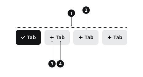
- Group container – Wraps the buttons and manages spacing, alignment, borders, and wrapping..
- Button – Individual selectable option (extends Button component).
- Selection icon (optional) – Used mainly in multi-select patterns (e.g., plus → checkmark).
- Label – Text inside each button describing the option.
Key ButtonGroup Props
Use these props to configure the ButtonGroup component.
children
ButtonGroup.Button components to display.
| Type | Example | Description |
|---|---|---|
React.ReactNode | ButtonGroup.Button components |
Code example
<ButtonGroup>
  <ButtonGroup.Button id="btn-1">Option 1</ButtonGroup.Button>
  <ButtonGroup.Button id="btn-2">Option 2</ButtonGroup.Button>
</ButtonGroup>
multiple
Whether multiple buttons can be selected simultaneously.
| Type | Example | Description |
|---|---|---|
boolean | Enables multi-select mode |
Code example
<ButtonGroup multiple>
  <ButtonGroup.Button id="btn-1">Option 1</ButtonGroup.Button>
  <ButtonGroup.Button id="btn-2">Option 2</ButtonGroup.Button>
</ButtonGroup>
defaultValue
Initial selected value(s) for uncontrolled component.
| Type | Example | Description |
|---|---|---|
string | string[] | Initial selected value(s) |
Code example
<ButtonGroup defaultValue="btn-1">
  <ButtonGroup.Button id="btn-1">Option 1</ButtonGroup.Button>
  <ButtonGroup.Button id="btn-2">Option 2</ButtonGroup.Button>
</ButtonGroup>

<ButtonGroup multiple defaultValue={['btn-1', 'btn-2']}>
  <ButtonGroup.Button id="btn-1">Option 1</ButtonGroup.Button>
  <ButtonGroup.Button id="btn-2">Option 2</ButtonGroup.Button>
</ButtonGroup>
value
Current selected value(s) for controlled component.
| Type | Example | Description |
|---|---|---|
string | string[] | Controlled selected value(s) |
Code example
const [selected, setSelected] = useState('btn-1');

<ButtonGroup value={selected} onChange={setSelected}>
  <ButtonGroup.Button id="btn-1">Option 1</ButtonGroup.Button>
  <ButtonGroup.Button id="btn-2">Option 2</ButtonGroup.Button>
</ButtonGroup>
variant
Visual style variant of the buttons.
| Value | Example | Description | Purpose |
|---|---|---|---|
primary | Primary button style | Best for prominent selections that control the main view content; easier to scan at a glance. | |
secondary | Secondary button style | Best for supportive controls (e.g., additional filters); use sparingly when the UI is already simple. |
Code example
<ButtonGroup variant="primary">
  <ButtonGroup.Button id="btn-1">Primary</ButtonGroup.Button>
</ButtonGroup>
<ButtonGroup variant="secondary">
  <ButtonGroup.Button id="btn-2">Secondary</ButtonGroup.Button>
</ButtonGroup>
size
Size of the buttons.
| Value | Example | Description |
|---|---|---|
xs | Extra small size | |
sm | Small size | |
md | Medium size (default) | |
lg | Large size |
Code example
<ButtonGroup size="xs">
  <ButtonGroup.Button id="btn-1">XS</ButtonGroup.Button>
</ButtonGroup>
<ButtonGroup size="sm">
  <ButtonGroup.Button id="btn-2">SM</ButtonGroup.Button>
</ButtonGroup>
showIcon
Whether to show selection icons in multiple selection mode.
| Type | Example | Description |
|---|---|---|
boolean | Shows check/plus icons in multiple selection mode |
Code example
<ButtonGroup multiple showIcon>
  <ButtonGroup.Button id="btn-1">Option 1</ButtonGroup.Button>
  <ButtonGroup.Button id="btn-2">Option 2</ButtonGroup.Button>
</ButtonGroup>
Behavior
- ButtonGroup manages selection state internally or via controlled props.
- Single-select mode
- Only one option can be selected at a time.
- Selecting a new option deselects the previous one.
- Multi-select mode
- Each button toggles independently.
- Multiple options can be active simultaneously.
- When space is limited, the group may wrap into multiple rows.
- Keyboard interaction:
- Arrow keys move focus within the group.
- Space or Enter selects or toggles the focused option.
Accessibility
- Provide a descriptive group label using
aria-label,aria-labelledby, or visible text. - Use
role="radiogroup"for single-select patterns, orrole="group"for multi-select/toggle patterns. - In multi-select patterns, use aria-pressed on buttons to expose toggle state.
- Ensure full keyboard access (Tab, Arrow keys, Enter, Space).
(WCAG 2.1.1 — Keyboard)
Implementation Examples
ButtonGroup with line breaks
Code example
<div style={{ maxWidth: '400px' }}>
  <ButtonGroup>
    <ButtonGroup.Button id="mon">Maanantai</ButtonGroup.Button>
    <ButtonGroup.Button id="tue">Tiistai</ButtonGroup.Button>
    <ButtonGroup.Button id="wed">Keskiviikko</ButtonGroup.Button>
    <ButtonGroup.Button id="thu">Torstai</ButtonGroup.Button>
    <ButtonGroup.Button id="fri">Perjantai</ButtonGroup.Button>
    <ButtonGroup.Button id="sat">Lauantai</ButtonGroup.Button>
    <ButtonGroup.Button id="sun">Sunnuntai</ButtonGroup.Button>
  </ButtonGroup>
</div>
ButtonGroup with SwiperJS
Drag or swipe the container to see all the buttons
Code example
import 'swiper/css';
import { Swiper, SwiperSlide } from 'swiper/react';
import { Mousewheel, FreeMode } from 'swiper/modules';
import { ButtonGroup } from '@yleisradio/yds-components-react';

export const ButtonGroupSwiper = () => {
  return (
    <ButtonGroup style={{ width: '400px' }}>
      <Swiper
        modules={[Mousewheel, FreeMode]}
        slidesPerView="auto"
        spaceBetween={12}
        slideToClickedSlide
        freeMode={{
          enabled: true,
          sticky: true,
        }}
        mousewheel={{
          enabled: true,
          sensitivity: 1.5,
          forceToAxis: true,
        }}
      >
        <SwiperSlide style={{ width: 'auto' }}>
          <ButtonGroup.Button id="hours">Lähitunnit</ButtonGroup.Button>
        </SwiperSlide>
        <SwiperSlide style={{ width: 'auto' }}>
          <ButtonGroup.Button id="days">Lähipäivät</ButtonGroup.Button>
        </SwiperSlide>
        <SwiperSlide style={{ width: 'auto' }}>
          <ButtonGroup.Button id="rain">Sadetutka</ButtonGroup.Button>
        </SwiperSlide>
        <SwiperSlide style={{ width: 'auto' }}>
          <ButtonGroup.Button id="wind">Tuuli</ButtonGroup.Button>
        </SwiperSlide>
        <SwiperSlide style={{ width: 'auto' }}>
          <ButtonGroup.Button id="alerts">Varoitukset</ButtonGroup.Button>
        </SwiperSlide>
      </Swiper>
    </ButtonGroup>
  );
};
Disabled ButtonGroup with significant selected option
While it's possible to disable all buttons in the button group, sometimes it's important to keep a significant
selected option visible (for example in tab-like single select scenarios). In this case, you can use the
aria-disabled attribute to indicate that the selected option in the button group is disabled,
but still make the selected option visible to the user. Use isDisabled prop for the unselected buttons.
Kirjaudu sisään Yle Tunnuksella ja näe henkilökohtaiset suosituksesi.
Code example
<div style={{ maxWidth: '400px' }}>
  <ButtonGroup value="all">
    <ButtonGroup.Button id="all" aria-disabled="true">
      <span>Kaikki</span>
    </ButtonGroup.Button>
    <ButtonGroup.Button isDisabled id="own">
      <span>Omat</span>
    </ButtonGroup.Button>
    <ButtonGroup.Button isDisabled id="fav">
      <span>Suosikit</span>
    </ButtonGroup.Button>
  </ButtonGroup>
  <div style={{ marginTop: '8px' }}>
    <Link href="#">Kirjaudu sisään Yle Tunnuksella</Link> ja näe henkilökohtaiset suosituksesi.
  </div>
</div>
API Reference
ButtonGroup Props
The ButtonGroup component accepts all standard HTML <div> attributes (except onChange) in addition to the following props:
| Prop | Type | Required | Default | Description |
|---|---|---|---|---|
children | React.ReactNode | Yes | — | ButtonGroup.Button components to display |
multiple | boolean | No | false | Whether multiple buttons can be selected |
defaultValue | string | string[] | No | — | Initial selected value(s) for uncontrolled |
value | string | string[] | No | — | Current selected value(s) for controlled |
onChange | (value: string | string[]) => void | No | — | Callback fired when selection changes |
variant | 'primary' | 'secondary' | No | 'primary' | Visual style variant |
size | 'xs' | 'sm' | 'md' | 'lg' | No | — | Size of the buttons |
showIcon | boolean | No | — | Shows selection icons in multiple mode |
ButtonGroup.Button Props
The ButtonGroup.Button component accepts all standard Button props (except iconAfter) in addition to the following props:
| Prop | Type | Required | Default | Description |
|---|---|---|---|---|
id | string | Yes | — | Unique identifier for tracking selection |
children | React.ReactNode | Yes | — | Button content |
Type Definitions
export interface ButtonGroupDSProps {
  children: React.ReactNode;
  multiple?: boolean;
  defaultValue?: string | string[];
  value?: string | string[];
  onChange?: (value: string | string[]) => void;
  variant?: 'primary' | 'secondary';
  size?: 'xs' | 'sm' | 'md' | 'lg';
  showIcon?: boolean;
}

export type ButtonGroupProps = Omit<React.HTMLAttributes<HTMLDivElement>, 'onChange'> &
  ButtonGroupDSProps;

export interface ButtonGroupButtonDSProps {
  id: string;
  children: React.ReactNode;
}

export type ButtonGroupButtonProps = Omit<ButtonProps<'button' | 'a'>, 'iconAfter'> &
  ButtonGroupButtonDSProps;
Related Components
- Button – ButtonGroup.Button extends Button functionality
- RadioGroup – Alternative for single-selection groups with form semantics
- CheckboxGroup – Alternative for multiple selection in forms
- DropdownMenuGroup – Use when the option list is long or space is limited
- NavigationTabs – Page-level navigation between major sections
- SectionTabs – Switching content within a single page or section