LiveSearchInput
LiveSearchInput is a search field that updates results in real-time as the user types. It is ideal for searching large content sets where users are likely to know what they are looking for.
Code example
import { LiveSearchInput } from '@yleisradio/yds-components-react';

const [value, setValue] = useState('');

<LiveSearchInput
  label="Live Search"
  placeholder="Search articles"
  description="Live Search Input description"
  value={value}
  onChange={(e) => setValue(e.target.value)}
/>;
Why to use
LiveSearchInput improves the search experience by providing instant feedback as users type, allowing them to refine queries without submitting.
It enables faster interaction, reduces cognitive load through recognition over recall, and guides users with real-time results and suggestions. This makes it especially effective for large datasets, aligns with familiar search patterns, supports filtering, and helps avoid empty or unsuccessful searches.
When to use
Use LiveSearchInput when users need to search a content set by typing keywords and seeing results update in real-time.
- Use LiveSearchInput for services with large content sets where users may not find content by browsing.
- Use it for global search (e.g., header search) or scoped search within a page or section.
- Use it when users are likely to know what they want to search for (keywords, titles, names).
- Use it when fast, real-time feedback improves efficiency and reduces unnecessary clicks.
- Use it with lists and tables to quickly filter and find rows within large datasets.
- Don't use LiveSearchInput for choosing from predefined options — use Select or ComboboxSingleSelect.
- Don't place LiveSearchInput where search is not relevant or expected.
- Don't use it for small content sets where users can find content by browsing.
- Don't use it when users are unlikely to know what to search for — prefer browsing or navigation instead.
Content Guidelines
LiveSearchInput text should help users understand what they can search and how. Keep labels and placeholders short, familiar, and specific to the search scope.
- Use a clear label that describes the search scope (e.g., "Hae", "Hae artikkeleita", "Hae ohjelmia").
- Use placeholder text as an example (e.g., "Kirjoita hakusana", "Hae artikkeleita").
- If the scope is not obvious, add helper text nearby (e.g., "Hakee vain ohjelmista").
- Don't rely on placeholder text alone to explain purpose.
- Don't duplicate the label in the placeholder.
- Don't use long instructional placeholders or rules — put constraints in helper text instead.
- Don't use jargon or unclear labels that don't indicate what is being searched.
Anatomy
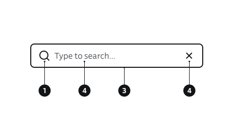
- Icon – Optional search icon.
- Search text (placeholder – Example text inside the field.
- Search field (input) – Area where the user types the query.
- Clear button – Appears automatically when text is present; clears the field.
Key Props
Use the following props to customize the LiveSearchInput component to fit your needs.
LiveSearchInput extends TextInput, so it also supports all TextInput props, except for icon and submitButton.
label
The visible label for the input field. Unlike SearchInput, the label is visible by default.
| Type | Required | Description |
|---|---|---|
string | Yes | Text displayed as the input label. |
labelOptions
Customize label behavior, such as hiding it visually while keeping it accessible for screen readers.
| Type | Default | Description |
|---|---|---|
FormElementLabelProps | { isHidden: false } | Options for label display and behavior. |
Code example
<LiveSearchInput
  label="Search"
  labelOptions={{ isHidden: true }}
  placeholder="Search articles"
  value={query}
  onChange={(e) => setQuery(e.target.value)}
/>
description
Helper text displayed below the input field, providing additional context to the user.
| Type | Default | Description |
|---|---|---|
string | — | Descriptive text shown below the input. |
errorMessage
Displays a validation error message below the input and applies error styling to the field.
| Type | Default | Description |
|---|---|---|
string | — | Error message shown below the input when set. |
isDisabled
Disables the input, preventing user interaction while keeping the field visible.
| Type | Default | Description |
|---|---|---|
boolean | false | Disables the input and sets aria-disabled="true". |
isRequired
Marks the input field as required.
| Type | Default | Description |
|---|---|---|
boolean | false | Sets the input as a required field. |
showLoadingIndicator
Shows a loading spinner inside the input field, typically used while fetching search results.
| Type | Default | Description |
|---|---|---|
boolean | false | Displays a loading indicator inside the input field. |
Code example
<LiveSearchInput
  label="Search"
  placeholder="Search articles"
  value={query}
  onChange={(e) => setQuery(e.target.value)}
  showLoadingIndicator
/>
iconBefore
Overrides the default search (magnifying glass) icon displayed before the input. Defaults to { componentFn: Search, ariaLabel: 'Hae' }.
| Type | Default | Description |
|---|---|---|
InputIconProps | { componentFn: Search, ariaLabel: 'Hae' } | Icon rendered before the input field. |
iconClear
Overrides the default clear button that appears when the input has a value. Defaults to { componentFn: CloseSmall, ariaLabel: 'Tyhjennä' }. Only shown when value is non-empty.
| Type | Default | Description |
|---|---|---|
InputIconProps | { componentFn: CloseSmall, ariaLabel: 'Tyhjennä' } | Clear button shown when the input has a value. |
hideIcon
Hides the default search icon (magnifying glass) before the input field.
| Type | Default | Description |
|---|---|---|
boolean | false | If true, the search icon is not rendered. |
iconBeforeAriaLabel
Custom aria-label for the search icon. Defaults to "Hae".
| Type | Default | Description |
|---|---|---|
string | "Hae" | Aria-label for the search icon. |
iconClearAriaLabel
Custom aria-label for the clear button. Defaults to "Tyhjennä".
| Type | Default | Description |
|---|---|---|
string | "Tyhjennä" | Aria-label for the clear button |
Behavior
- Results update in real-time as the user types — there is no explicit submit action.
- A clear button appears automatically when the field has text and clears the value when activated.
- The component can show a loading indicator (via
showLoadingIndicator) while fetching results. - The parent component is responsible for debouncing search requests if needed. This is especially important for asynchronous search requests or with large datasets.
- Disabled state prevents interaction but keeps the field visible.
- All interactive elements (input, clear) must be keyboard operable.
- Results should provide immediate, meaningful feedback (e.g., matches, no results, loading state).
- Updates should feel responsive but not overwhelming — avoid overly rapid changes that can confuse users.
Accessibility
- Always provide a label — it may be hidden visually, but it must remain accessible. This ensures users of assistive technologies know what the field is for.
(WCAG 3.3.2 — Labels or Instructions). - The clear button has a built-in accessible label ("Tyhjennä").
(WCAG 2.1.1 — Keyboard). - Keyboard support: Tab/Shift+Tab moves focus between the input and clear button.
- The magnifying glass icon is a widely recognized symbol and doesn't need to include the word "search" visually. However, it must have an accessible label for screen readers.
(WCAG 3.3.2 — Labels or Instructions). - Use screen-reader compatible feedback such as loading/disabled states, result counts, and empty states to guide users.
Implementation examples
Basic usage
Code example
const [value, setValue] = useState('');

<LiveSearchInput
  label="Search"
  placeholder="Search articles"
  value={value}
  onChange={(e) => setValue(e.target.value)}
/>;
Icon hidden
Code example
const [value, setValue] = useState('');

<LiveSearchInput
  label="Search"
  placeholder="Search articles"
  value={value}
  onChange={(e) => setValue(e.target.value)}
  hideIcon
/>;
Search with results
There's currently no built-in component for displaying search results. You can use Menu or custom list / table component to display the results – this example uses a simple unordered list for demonstration purposes.
Code example
const [query, setQuery] = useState('');
const [results, setResults] = useState([]);
const [isLoading, setIsLoading] = useState(false);
const items = ['Item one', 'Item two', 'Item three'];

useEffect(() => {
if (!query) {
setResults([]);
setIsLoading(false);
return;
}
setIsLoading(true);
const timer = setTimeout(() => {
setResults(items.filter((item) => item.toLowerCase().includes(query.toLowerCase())));
setIsLoading(false);
}, 800);
return () => clearTimeout(timer);
}, [query]);

<LiveSearchInput
  label="Search"
  placeholder="Search items"
  value={query}
  onChange={(e) => setQuery(e.target.value)}
  showLoadingIndicator={isLoading}
/>
{query && !isLoading && (
  <ul>
    {results.length > 0
      ? results.map((r) => <li key={r}>{r}</li>)
      : <li>No results found.</li>}
  </ul>
)}
With loading indicator
Code example
<LiveSearchInput
  label="Search"
  placeholder="Search articles"
  value={query}
  onChange={(e) => setQuery(e.target.value)}
  showLoadingIndicator={isLoading}
/>
With error message
Code example
<LiveSearchInput
  label="Search"
  placeholder="Search articles"
  value={query}
  onChange={(e) => setQuery(e.target.value)}
  errorMessage={error}
/>
Disabled
Code example
<LiveSearchInput label="Search" placeholder="Search disabled" isDisabled />
API Reference
Props
LiveSearchInput
The LiveSearchInput component accepts all standard HTML <input> attributes in addition to the following props. LiveSearchInput extends TextInput, so it supports all TextInput props except icon and submitButton:
| Prop | Type | Required | Default | Description |
|---|---|---|---|---|
label | string | Yes | — | Text displayed as the input label. |
labelOptions | FormElementLabelProps | No | { isHidden: false } | Options for label display and behavior. |
description | string | No | — | Helper text displayed below the input. |
errorMessage | string | No | — | Error message shown below the input. |
isDisabled | boolean | No | false | Disables the input and sets aria-disabled. |
isRequired | boolean | No | false | Marks the input as required. |
showLoadingIndicator | boolean | No | false | Shows a loading spinner inside the input field. |
iconBefore | InputIconProps | No | { componentFn: Search, ariaLabel: 'Hae' } | Icon rendered before the input field. |
iconClear | InputIconProps | No | { componentFn: CloseSmall, ariaLabel: 'Tyhjennä' } | Clear button shown when the input has a value. |
hideIcon | boolean | No | false | If true, the search icon is not rendered. |
iconBeforeAriaLabel | string | Yes | "Hae" | Aria-label for the search icon. |
iconClearAriaLabel | string | Yes | "Tyhjennä" | Aria-label for the clear button. |
Type Definitions
LiveSearchInput
export type LiveSearchInputDSProps = Omit<TextInputDSProps, 'icon' | 'submitButton'> & {
  hideIcon?: boolean;
  iconBeforeAriaLabel: string;
  iconClearAriaLabel: string;
};
Related Components
- SearchInput: For submit-based search with an explicit search button.
- TextInput: For single-line text input.