Toast Notification
A Toast Notification is a short-lived, floating message that appears above the content to confirm an action or display a temporary system status before dismissing automatically.
Code example
import {
  Button,
  ToastNotifications,
  ToastProvider,
  useToast,
  type ToastNotificationProps,
} from '@yleisradio/yds-components-react';

export type ToastProps = ToastNotificationProps & { buttonText?: string };

const ToastButton = ({ buttonText, ...props }: ToastProps) => {
  const toast = useToast();
  return <Button onClick={() => toast({ ...props })}>{buttonText ?? 'Toast!'}</Button>;
};

export const Toast = (props: ToastProps) => {
  return (
    <ToastProvider>
      <ToastButton {...props} />
      <ToastNotifications />
    </ToastProvider>
  );
};
Code example
const toast = useToast();
toast({ level: 'success', duration: 3000, children: 'This is a toast notification' })}
Why to use
Toast Notifications provide lightweight, unobtrusive feedback for brief, non-critical events. They confirm that an action has occurred without interrupting the user’s flow or requiring acknowledgment.
When to use
Use a Toast Notification to communicate short-lived, non-critical feedback that does not require user action and should not block interaction.
- Use Toasts for quick confirmations or acknowledgements (e.g., “Tallennettu”, “Kopioitu”, “Päivitetty”).
- Use them for transient system events that users should notice but not focus on (e.g., “Yhteys palautettu”).
- Use Toasts when the message can safely disappear without user interaction.
- Don’t use Toasts for critical, blocking, or persistent information.
- Don’t use Toasts when the user must read, understand, or act on the message.
- Don’t use Toasts for validation errors or field-specific feedback.
- Don’t use Toasts as a replacement for Notifications or BannerNotifications.
Differences between Notification Types
| Type | Purpose | Placement | Use case |
|---|---|---|---|
| Banner Notification | A notification covering the entire view or service (e.g., maintenance, error state). | Fixed, below the header. | “Maintenance in progress” |
| Inline Notification | A local notification within content or a form (e.g., field error). | Embedded in content. | “This field is required” |
| Toast Notification | A short-lived, automatically disappearing feedback message (e.g., save confirmation). | Floating near the bottom of the screen, sliding in and out smoothly. | “Saved successfully” |
Content Guidelines
Toast content must be immediately understandable at a glance, as messages are displayed briefly and overlay the UI.
- Keep messages to one short sentence or a few words.
- Focus on the outcome, not the process (e.g., “Lähetetty”, “Kopioitu leikepöydälle”).
- Use clear, neutral language.
- Keep wording consistent for repeated events.
- Use icons only to reinforce meaning, not to explain it.
- Don’t include instructions, explanations, or multiple ideas.
- Don’t combine multiple updates.
- Don’t use vague phrasing (e.g., “Jotain tapahtui”).
- Don’t add filler language or politeness.
- Don’t rely on the toast alone to convey critical information.
Anatomy
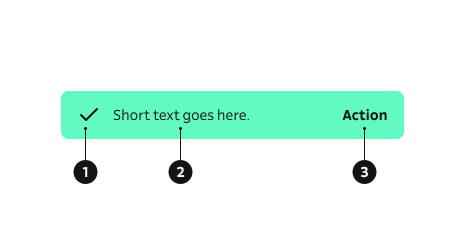
- Icon – Icon indicating the message level (info, success, warning, error).
- Body – Main message content.
- Action – Main action guiding the user’s next step.
Key ToastNotification Props
Toasts are triggered with the toast function from useToast(). Pass a props object matching ToastNotificationProps.
level
Sets semantic and visual styling (icon + colors).
| Value | Example | Description |
|---|---|---|
info | Neutral informational context. | |
success | Positive confirmation. | |
warning | Caution, needs attention soon. | |
error | Critical or blocking issue. |
Code example
toast({ level: 'info', children: 'General information' });
toast({ level: 'success', children: 'Changes saved' });
toast({ level: 'warning', children: 'Unstable connection' });
toast({ level: 'error', children: 'Upload failed' });
children (message)
Main textual content. Keep it short (typically one sentence).
| Type | Example | Description |
|---|---|---|
ReactNode | Message body displayed inside toast. |
Code example
toast({ level: 'success', children: 'Profile updated' });
icon
Override default icon for a given level.
| Type | Example | Description |
|---|---|---|
ReactNode | Replaces semantic default icon. |
Code example
import { Star } from '@yleisradio/yds-icons-react';
toast({ level: 'info', icon: <Star />, children: 'Favorited' });
hideIcon
Suppress level icon.
| Type | Example | Description |
|---|---|---|
boolean | Removes icon for minimal style. |
Code example
toast({ level: 'info', hideIcon: true, children: 'Plain text toast' });
hideCloseButton
Omits manual close button. When hideCloseButton is true and no duration is given, a default auto-dismiss of 3000ms is applied.
| Type | Example | Description |
|---|---|---|
boolean | Auto-dismiss only; no manual close. |
Code example
// Auto dismiss after default 3000ms
toast({ level: 'success', hideCloseButton: true, children: 'Saved successfully' });
duration
Total visible time (ms). If provided AND hideCloseButton is false, a timer bar is shown. If hideCloseButton is true, duration overrides the default 3000ms but no timer bar appears.
| Type | Example | Description |
|---|---|---|
number | Time before auto-dismiss. |
Code example
// With timer bar (close button visible)
toast({ level: 'info', duration: 5000, children: 'Will hide after 5s' });

// Without close button (no timer bar)
toast({ level: 'info', hideCloseButton: true, duration: 6000, children: 'Auto hides after 6s' });
closeText
Custom text label for the close button if no closeIcon is supplied. Defaults to "Sulje".
| Type | Example | Description |
|---|---|---|
string | Localized close label. |
Code example
toast({ level: 'info', closeText: 'Dismiss', children: 'Message sent' });
Behavior
- Toasts appear floating above content, typically near the bottom of the viewport.
- They dismiss automatically after a short duration.
- Toasts do not take focus or interrupt the user’s ongoing task.
- A close button may be provided when the message needs more time to read.
- When a timer bar is shown, it reflects the remaining visible time; clicking the toast removes the timer and keeps it visible until manually closed.
- Each toast conveys one concise message, with an optional icon and Close button.
- Repeated toasts should not overwhelm the user or stack excessively.
- Critical or persistent information should be surfaced elsewhere (e.g. inline notification, banner, or message log).
Animation behavior
- Toast notification appears from the bottom of viewport.
- Duration timer decreases from right to left.
| Action | Duration | Easing |
|---|---|---|
| Appear | m / 250ms | dec / cubic-bezier(0.17, 0.84, 0.44, 1) |
| Timer bar | duration (default: 3000 ms) | lin / linear |
| Exit | m / 250ms | dec / cubic-bezier(0.17, 0.84, 0.44, 1) |
Accessibility
- Uses a live region to be announced by assistive tech:
aria-live="polite". - Ensures sufficient color contrast per WCAG 2.1 – 1.4.3 (AA) and avoids color-only meaning (1.3.1).
- Visible focus and full keyboard operability for the Close control (2.1.1 Keyboard, 2.4.7 Focus Visible).
- Shows long enough to read (at least 3 s); provide a Close control and/or a way to pause auto-dismiss when necessary (2.2.2 Pause, Stop, Hide).
- Critical information is also available elsewhere (e.g., inline error) so the message is not lost (4.1.3 Status Messages).
Implementation examples
Basic toast (manual close)
Code example
const TriggerBasicToastInline = () => {
  const toast = useToast();
  return (
    <Button
      text="Show success toast"
      onClick={() => toast({ level: 'success', children: 'Changes saved' })}
    />
  );
};

<ToastProvider>
  <TriggerBasicToastInline />
  <ToastNotifications />
</ToastProvider>
Auto dismiss (no close button)
Code example
const TriggerAutoDismissToast = () => {
  const toast = useToast();
  return (
    <Button
      text="Show auto toast"
      onClick={() => toast({ level: 'info', hideIcon: true, hideCloseButton: true, children: 'Copied to clipboard' })}
    />
  );
};

<ToastProvider>
  <TriggerAutoDismissToast />
  <ToastNotifications />
</ToastProvider>
With timer bar (duration + close)
Code example
const TriggerTimedToast = () => {
  const toast = useToast();
  return (
    <Button
      text="Show timed toast"
      onClick={() => toast({ level: 'warning', duration: 5000, children: 'Network unstable' })}
    />
  );
};

<ToastProvider>
  <TriggerTimedToast />
  <ToastNotifications />
</ToastProvider>
API Reference
Props
The ToastNotification component accepts the following props when using the toast function from useToast():
| Prop | Type | Required | Default | Description |
|---|---|---|---|---|
icon | ReactNode | No | — | |
level | NotificationLevel | Yes | — | |
duration | number | No | — | |
hideCloseButton | boolean | No | — | |
children | ReactNode | No | — | |
hideIcon | boolean | No | — |
Type Definitions
export type NotificationLevel = 'info' | 'success' | 'warning' | 'error';

export type ToastNotificationProps = {
  icon?: ReactNode;
  level: NotificationLevel;
  duration?: number;
  hideCloseButton?: boolean;
  children?: ReactNode;
  hideIcon?: boolean;
};
Related Components
- Notification – Inline contextual messages that persist until state changes.
- BannerNotification – Page/service-wide announcements below the header.