Select
The Select component displays a predefined list of options, allowing the user to choose one, and is commonly used in forms or filters.
Code example
import { Select } from '@yleisradio/yds-components-react';

<Select
  id="select-basic"
  name="selectBasic"
  label="Category"
  placeholder="Select an option"
  items={[
    { label: 'News', value: 'news' },
    { label: 'Sports', value: 'sports' },
    { label: 'Culture', value: 'culture', disabled: true }
  ]}
  onChange={() => {}}
/>
Why to use
Select provides a compact way to display multiple options and ensures consistent input values by restricting users to a predefined list.
When to use
Use a Select when users must choose a single option from a predefined list. Select works best with short, familiar lists where searching is unnecessary and where restricting input prevents errors.
Select is well suited for forms, filters and settings where choices are stable and clearly defined.
- Use a Select when the user needs to choose a single item from a short list (fewer than 8 options).
- Use a Select when filtering by typing is not required.
- Organize options logically or alphabetically.
- Provide helper text when options need clarification.
- Keep option lists short and comparable.
- Always provide a clear, descriptive label.
- Don’t use a Select when there are 8 or more options — use a ComboboxSingleSelect instead.
- Don’t use a Select if the user needs to filter or search options by typing.
- Don’t use Select for navigation or triggering actions — use an ActionMenu instead.
- Don’t rely on placeholder text as the only instruction, as it’s skipped by screen readers.
- Don’t overload the dropdown with unnecessary contextual information.
Content Guidelines
Select fields must present clear, concise labels and easy-to-scan option lists. Consistency is important, as users choose from predetermined values.
- Use short, descriptive labels (e.g., “Kategoria”, “Kieli”, “Tila”).
- Keep option labels consistent in style (esim. kaikki substantiiveja).
- Use compact placeholder text (e.g., “Valitse vaihtoehto”).
- Add helper text when selection needs extra context (e.g., “Valitse pääasiallinen kategoria”).
- Write specific and helpful error messages (e.g., “Valinta vaaditaan”).
- Order items logically (alphabetically, most common first).
- Don’t duplicate the same text in label and placeholder.
- Don’t use ambiguous labels (e.g., “Vaihtoehto 1”).
- Don’t embed explanations inside option labels.
- Don’t rely solely on placeholder text — it disappears after selection.
- Don’t mix inconsistent naming patterns.
Anatomy
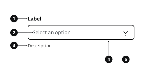
- Label – Describes the purpose of the field.
- Placeholder – Example or hint text shown before a selection is made.
- Description – Additional guidance or context below the field.
- Input field – Visual container that communicates interaction and validation states.
- Dropdown indicator – Icon showing the dropdown state and affordance to open options.
Select dropdown follows native browser rendering and behavior, which may vary slightly across platforms.
Key Props
Use the following props to customize the Select component to fit your needs.
items
Array of option objects. Each option renders an <option> inside the native <select>.
| Prop | Shape | Description |
|---|---|---|
items | { label: string; value?: string; disabled?: boolean }[] | List of options. value defaults to label when omitted. disabled makes option non-selectable. |
Code example
<Select
  id="country"
  name="country"
  label="Country"
  items={[
    { label: 'Finland', value: 'fi' },
    { label: 'Sweden', value: 'se' },
    { label: 'Norway', value: 'no', disabled: true },
  ]}
  onChange={() => {}}
  placeholder="Select country"
  onChange={() => {}}
/>
placeholder
Shown as the first hidden option. If provided, the underlying select is marked required, encouraging explicit selection.
| Type | Example | Description |
|---|---|---|
string | Initial unselected guidance. |
Code example
<Select
  id="ph"
  name="ph"
  label="Category"
  placeholder="Select an option"
  items={[{ label: 'Option A' }, { label: 'Option B' }]}
  onChange={() => {}}
/>
label
Label can be visually hidden but must remain readable for screen readers.
| Type | Example | Description |
|---|---|---|
string | Provides a clear purpose the field. |
Code example
<Select
  id="desc"
  name="desc"
  label="Category"
  items={[{ label: 'News' }, { label: 'Sports' }]}
  onChange={() => {}}
/>
description
Helper guidance placed below the field.
| Type | Example | Description |
|---|---|---|
string | Provides additional guidance below the field. |
Code example
<Select
  id="desc"
  name="desc"
  label="Category"
  description="Choose primary category"
  items={[{ label: 'News' }, { label: 'Sports' }]}
  onChange={() => {}}
/>
success
| Type | Example | Description |
|---|---|---|
boolean | Shows success border when no error present. |
Code example
<Select
  id="ok"
  name="ok"
  label="Category"
  success
  items={[{ label: 'Option A' }, { label: 'Option B' }]}
  value="Option A"
  onChange={() => {}}
/>
errorMessage
| Type | Example | Description |
|---|---|---|
string | Displays a validation error below the field. Sets aria-invalid. |
Code example
<Select
  id="err"
  name="err"
  label="Category"
  errorMessage="Selection required"
  items={[{ label: '' }, { label: 'Option A' }, { label: 'Option B' }]}
  onChange={() => {}}
/>
isDisabled
| Type | Example | Description |
|---|---|---|
boolean | Temporarily prevents user interaction. |
Code example
<Select
  id="dis"
  name="dis"
  label="Category"
  isDisabled
  items={[{ label: 'One' }, { label: 'Two' }]}
  onChange={() => {}}
/>
Behavior
- The dropdown opens on click and closes after selection.
- The selected item replaces the placeholder text.
- Disabled state blocks user interaction and dims visuals.
- Error state displays a red outline and error message.
- Optional fields are indicated with (Optional) in the label.
- Tooltips provide contextual information but not essential content.
Accessibility
- Always provide a label — required for assistive technologies.
- Placeholder text is not read by screen readers and disappears after selection.
- Ensure full keyboard accessibility (Tab, Arrow keys, Enter)
(WCAG 2.1.1 — Keyboard)
Implementation examples
Gender selection
Code example
<Select
  id="ex-basic"
  name="exBasic"
  label="Gender"
  placeholder="Select an option"
  items={[
    { label: 'Female' },
    { label: 'Male' },
    { label: 'Other' },
    { label: 'Prefer not to say' },
  ]}
  onChange={() => {}}
/>
Preselected value
Code example
<Select
  id="ex-pre"
  name="exPre"
  label="Status"
  items={[{ label: 'Open' }, { label: 'Closed' }]}
  value="Closed"
  onChange={() => {}}
/>
With error
Code example
<Select
  id="ex-error"
  name="exError"
  label="Category"
  errorMessage="Selection required"
  items={[{ label: '' }, { label: 'Option A' }, { label: 'Option B' }]}
  onChange={() => {}}
/>
API Reference
Props
The Select component accepts all standard HTML <select> attributes in addition to the following props:
| Prop | Type | Required | Default | Description |
|---|---|---|---|---|
label | string | Yes | — | |
labelOptions | FormElementLabelDSProps | No | {} | |
name | string | Yes | — | |
id | string | Yes | — | |
value | string | No | — | |
placeholder | string | No | — | |
onChange | (e: React.ChangeEvent<HTMLSelectElement>) => void | Yes | — | |
description | string | No | — | |
errorMessage | string | No | — | |
success | boolean | No | false | |
isDisabled | boolean | No | false | |
items | Option[] | Yes | — |
Type Definitions
interface Option {
  value?: string;
  label: string;
  disabled?: boolean;
}

export interface SelectDSProps {
  label: string;
  labelOptions?: FormElementLabelDSProps;
  name: string;
  id: string;
  value?: string;
  placeholder?: string;
  onChange: (e: React.ChangeEvent<HTMLSelectElement>) => void;
  description?: string;
  errorMessage?: string;
  success?: boolean;
  isDisabled?: boolean;
  items: Option[];
}

export type SelectProps = SelectHTMLAttributes<HTMLSelectElement> & SelectDSProps;
Related Components
- TextInput: For single-line open text responses.
- TextArea: For multi-line open text responses.
- SearchInput: For search functionality.
- ComboboxSingleSelect: For searchable single-select dropdowns.
- DropdownMenu: For actionable dropdowns.
- Radio: For selecting one option from a small set of choices.
- Slider: For selecting a numeric value from a bounded range.