TextInput
A TextInput is a single-line field that allows users to enter short, structured information such as names, email addresses or titles.
Code example
import { TextInput } from '@yleisradio/yds-components-react';

{' '}
<TextInput label="Label" placeholder="Placeholder" />
Why to use
TextInput allows users to enter short, structured information quickly and accurately. It supports validation, helper text, and clear feedback, helping users understand what is expected and complete tasks efficiently. Use TextInput whenever a concise textual value is required as part of a form, dialog, or inline interaction.
When to use
Use TextInput when users need to enter short, single-line information that benefits from clarity, validation, or guidance.
- Use TextInput for short, single-line input (e.g., “Etunimi”, “Sähköposti”).
- Use it when input follows clear rules or formats.
- Use it in forms, dialogs, inline edits, and search fields.
- Use it when the value fits naturally on one line and should be easy to scan.
- Don’t use TextInput for multi-line input — use TextArea.
- Don’t use it for choosing from predefined options — use Select or ComboboxSingleSelect.
- Don’t use it for long or unstructured free-form text.
- Don’t use it when input purpose is unclear or hidden.
Content Guidelines
TextInput content should clearly communicate what information is required and how to provide it, without unnecessary cognitive effort.
- Use short, descriptive labels (e.g., “Sähköposti”, “Otsikko”).
- Use placeholder text only as an example, not as instructions.
- Add concise helper text for extra context (esim. “3–16 merkkiä”).
- Write specific error messages that explain how to fix the problem. (e.g.,“Syötä voimassa oleva sähköpostiosoite”).
- Keep terminology and phrasing consistent across similar fields.
- Don’t use placeholder text instead of a label.
- Don’t repeat the label text inside the placeholder.
- Don’t use vague or generic labels (e.g., “Teksti”, “Arvo”).
- Don’t include long explanations in labels or descriptions.
- Don’t rely on placeholder text alone — it disappears when typing starts.
Anatomy
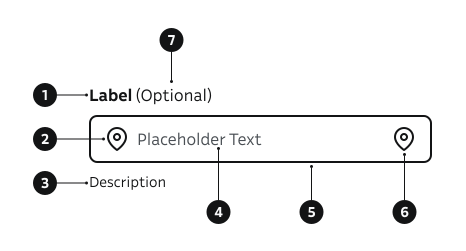
- Label – Describes the purpose of the field.
- Start icon – Decorative or contextual symbol.
- Description – Provides additional guidance below the field.
- Placeholder – Example or hint text inside the field.
- Input field – Area where users enter text.
- End icon – Decorative or functional symbol, e.g., visibility toggle.
- Optional field indicator – Shows that the field is not required to fill.
Key Props
Use the following props to customize the TextInput component to fit your needs.
type
Supported HTML input types. Invalid values fall back to text.
| Value | Example | Description |
|---|---|---|
text | Generic free-form text. | |
email | Email address pattern (may trigger native validation/UI). | |
password | Obscures characters for secrets. | |
number | Numeric value (spinner / numeric keyboard). | |
tel | Telephone number (phone keypad on mobile). | |
search | Search field styling (enables native clear in some browsers). |
Code example
<TextInput label="Email" id="email" type="email" placeholder="name@example.com" />
<TextInput label="Password" id="pwd" type="password" />
<TextInput label="Search" id="search" type="search" placeholder="Search" />
label
Label can be visually hidden but must remain readable for screen readers.
| Type | Example | Description |
|---|---|---|
string | Provides a clear purpose for the field. |
Code example
<TextInput label="Username" id="username" />
description
Helper guidance placed below the field.
| Type | Example | Description |
|---|---|---|
string | Provides additional guidance below the field. |
Code example
<TextInput
  label="Username"
  id="username"
  description="3–16 characters"
  placeholder="Enter username"
/>
success
| Type | Example | Description |
|---|---|---|
boolean | Indicates successful validation. |
Code example
<TextInput label="Email" id="email-input" type="email" success />
errorMessage
| Type | Example | Description |
|---|---|---|
string | Displays a validation error below the field. Sets aria-invalid. |
Code example
<TextInput label="Email" id="email-error" type="email" errorMessage="Invalid email" />
isDisabled
Non-interactive, dimmed styling.
| Type | Example | Description |
|---|---|---|
boolean | Temporarily prevents user interaction. |
Code example
<TextInput label="Disabled input" id="disabled-input" isDisabled />
isRequired
| Type | Example | Description |
|---|---|---|
boolean | Marks field mandatory for submission. |
Code example
<TextInput label="First name" id="name" isRequired />
showLoadingIndicator
Shows a spinner inside the input (left side) while async work occurs (e.g. validating, fetching suggestions).
| Type | Example | Description |
|---|---|---|
boolean | Renders spinner and adjusts padding. |
Code example
<TextInput label="Search" id="search-loading" showLoadingIndicator value="Searching" />
Icons
Decorative or actionable icons. Provide meaningful ariaLabel for interactive ones.
| Props | Example | Description |
|---|---|---|
iconBefore | Static or clickable icon before text. | |
icon | Static or clickable icon after text. |
Code example
import { Eye, Search } from '@yleisradio/yds-icons-react';

<TextInput
  label="Search"
  id="search-x"
  type="search"
  iconBefore={{ componentFn: Search, ariaLabel: 'Search icon' }}
/>

<TextInput
  label="Password"
  id="pwd"
  type="password"
  icon={{ componentFn: Eye, ariaLabel: 'Toggle password visibility', onClick: () => {} }}
/>
unit
An optional unit string displayed right-aligned and bold inside the input box (e.g. %, €, vuotta). Intended for numeric inputs where the unit is a fixed contextual label. The unit is linked to the input via aria-describedby so screen readers announce it when the input is focused.
| Type | Example | Description |
|---|---|---|
string | Displays a unit after the typed value inside the field. |
Code example
<TextInput label="Maksuaika" id="maksuaika" type="number" unit="vuotta" />
<TextInput label="Lainan määrä" id="laina" type="number" unit="€" />
<TextInput label="Viitekorko" id="korko" type="number" unit="%" />
- The
unitprop is not designed to be combined withicon,iconClear, orsubmitButton. It can coexist withiconBeforeandshowLoadingIndicator. - Use short, static strings. The unit takes its natural width and pushes the input to the left.
autocomplete
Pass through native browser autocomplete hint (e.g. email, username, current-password).
| Prop | Example | Description |
|---|---|---|
autocomplete | Helps browsers suggest stored values / show suitable keyboard. |
Code example
<TextInput label="Email" id="email-ac" type="email" autocomplete="email" />
See MDN Autocomplete attribute for all possible values.
Behavior
- The label is always associated with the input and appears above it.
- The input shows a visible focus state when focused.
- Validation feedback is shown using success or error states.
- Error messages appear below the input and describe how to resolve the issue.
- Disabled inputs remain visible but cannot be edited.
- Placeholder text disappears once the user starts typing.
- Icons may be decorative or interactive; interactive icons must be operable and accessible.
- Supports both controlled and uncontrolled usage.
Accessibility
- Every TextInput must have a visible or programmatically associated label.
- Interactive icons (such as password visibility toggles) must include a descriptive
aria-label.
(WCAG 3.3.2 — Labels or Instructions) - Ensure full keyboard accessibility — users should be able to navigate using
Tab,Shift+Tab, and activate controls withEnter.
(WCAG 2.1.1 — Keyboard)
Implementation examples
Phone number
How to use placeholder, description and optional label in TextInput.
Code example
import { TextInput } from '@yleisradio/yds-components-react';
<TextInput label="Phone number" labelOptions={{ optionalLabel: '(Optional)' }} placeholder="+358" description="Enter phone number in international format" type="tel" />
With error
Error state provides a clear indication that went wrong and error message tells how to fix it.
Code example
import { TextInput } from '@yleisradio/yds-components-react';
<TextInput label="Email" value="Invalid value" type="email" errorMessage="Please enter a valid email address" />
API Reference
Props
The TextInput component accepts all standard HTML <input> attributes in addition to the following props:
| Prop | Type | Required | Default | Description |
|---|---|---|---|---|
label | string | Yes | — | |
labelOptions | FormElementLabelProps | No | {} | |
id | string | No | — | |
value | string | No | — | |
onChange | React.ChangeEventHandler<HTMLInputElement> | No | — | |
placeholder | string | No | — | |
description | string | No | — | |
errorMessage | string | No | — | |
autocomplete | string | No | — | |
type | 'text' | 'email' | 'password' | 'number' | 'tel' | 'search' | No | 'text' | |
success | boolean | No | false | |
isRequired | boolean | No | false | |
isDisabled | boolean | No | false | |
children | ReactNode | No | — | |
icon | InputIconProps | No | — | |
submitButton | ReactNode | No | — | |
iconBefore | InputIconProps | No | — | |
iconClear | InputIconProps | No | — | |
showLoadingIndicator | boolean | No | false | |
unit | string | No | — | Unit label displayed right-aligned inside the field (e.g. %, €, vuotta). Announced via aria-describedby. |
Type Definitions
export type InputIconProps = {
  componentFn: (props: SVGProps<SVGSVGElement>) => JSX.Element;
  ariaLabel: string;
  onClick?: () => void;
  props?: ButtonHTMLAttributes<HTMLButtonElement>;
};

export type TextInputDSProps = {
  label: string;
  labelOptions?: FormElementLabelProps;
  id?: string;
  value?: string;
  onChange?: React.ChangeEventHandler<HTMLInputElement>;
  placeholder?: string;
  description?: string;
  errorMessage?: string;
  autocomplete?: string;
  type?: 'text' | 'email' | 'password' | 'number' | 'tel' | 'search';
  success?: boolean;
  isRequired?: boolean;
  isDisabled?: boolean;
  children?: ReactNode;
  icon?: InputIconProps;
  submitButton?: ReactNode;
  iconBefore?: InputIconProps;
  iconClear?: InputIconProps;
  showLoadingIndicator?: boolean;
  unit?: string;
};

export type TextInputProps = InputHTMLAttributes<HTMLInputElement> & TextInputDSProps;
Related Components
- TextArea: For multi-line responses.
- SearchInput: For search functionality.
- Select: For single-select dropdowns.
- ComboboxSingleSelect: For searchable single-select dropdowns.
- Slider: For picking a numeric value from a bounded range by dragging.